Exploring Color with an Expanded Painting Palette
I've always thought, 'what's the point of using and lugging around 10+ tubes of color when I can just use a limited palette and mix my own colors from just 3-5 main colors?'. And for the last 5-6 years of my painting career, I have relied heavily on a limited palette of red, yellow & blue to create 95% of my paintings. But things are changing - and I have decided to explore color more deeply in the hopes of creating paintings with stronger color moving forward. I also believe this may simplify color mixing for me - which may seem contradictory since I'm actually adding to my palette but allow me to explain my thoughts on this further.
Using a Limited Color Palette
When I began painting back in 2011, I found a limited palette useful for simplifying color mixing - it was straightforward: red and yellow made orange, blue and red made purple and so on. In this sense, a limited palette is a great way to begin learning to paint and mixing colors. I have personally witnessed beginner artists using more than 6 colors on their palette and not having a clue about what colors make what mixtures. That's the problem with using an expanded palette in the early days of learning. It's confusing and too much to handle [for most folks].

Expanding My Color Palette & Color Charts
And to be honest, after buying a few more colors and adding them to my palette, I felt overwhelmed and confused. I suddenly had Viridian, Mars Red, Yellow Ochre and other colors I'm not accustomed to using. And since I had no experience using them, that means I didn't know what mixtures I'd be able to make to get exactly what I need for a painting - especially when painting outdoors when I need a color quickly.
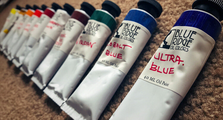
My Current Color Palette
So I took the advice from Richard Schmid's book Alla Prima and made some color charts for my new set of colors. Here are the colors now on my palette:
Titanium White
Cadmium Lemon
Cadmium Yellow Deep [Cad Yellow Medium in other brands]
Yellow Ochre
Indian Yellow [Cad Yellow Deep in other brands]
Cadmium Vermillion [or Cad Red Medium or Light]
Mars Red
Permanent Crimson
Transparent Oxide Red
Viridian
Ultramarine Blue

Interested in Painting? Join my Newsletter
Receive exclusive painting content via email.
Brand of Paint I Use
The brand I'm currently using is Blue Ridge Oil Colors which are handmade paints made by Eric Silver in North Carolina. Some of the paint [mostly the yellows] are named or made differently than other brands as I pointed out in the list above. In recent years, I've tried a lot of oil paint brands and used Gamblin the most but I find my favorite thus far being Blue Ridge Oil Paint - so for now, that's what I'm sticking with. I can speak about why I like them in a different post. Back to color.
Color Charts & How I Use Them
So I made the color charts. How it works is that each color on your palette has it's own chart. The Yellow Ochre chart is Yellow Ochre mixed with all the other colors but each mixture is predominately Yellow Ochre. For example, Yellow Ochre mixed with Viridian has mostly Yellow Ochre but for the Viridian chart, there's more Viridian in all the mixtures and so on. Then each row going down creates a lighter value of that mixture with the bottom row being just off-white. [See Yellow Ochre Chart below]

Once I finally finished all of the charts after almost 2 weeks, I can now see what my new color palette is capable of. Of course, these aren't the only mixtures I can make, they're just an overview. I can basically look at any subject now from life and by using my charts, determine what colors need to be mixed together to achieve a desired color. So this is what I meant earlier by saying it simplified color mixing for me. By just mixing only 2 colors + plus white together, I can get almost any color I need. Instead of spending a lot of time mixing as I did when using a limited palette, I can now get a certain color quite quickly and also replicate that color quickly and easily when or if I need to mix up more of it.
I'm going to commit to using this expanded palette for the next few months and see what happens. I may find one or two colors aren't necessary or that I need to swap one color out for a new color. Or I may find that it's just right. Time will tell.
How many colors do you have on your palette? What colors do you use? Let me know in the comment section below, I'd love to hear your thoughts.


I’m an artist exploring creativity, mindset, and the practice of making art over a lifetime. I share my work through writing, courses, and original paintings.