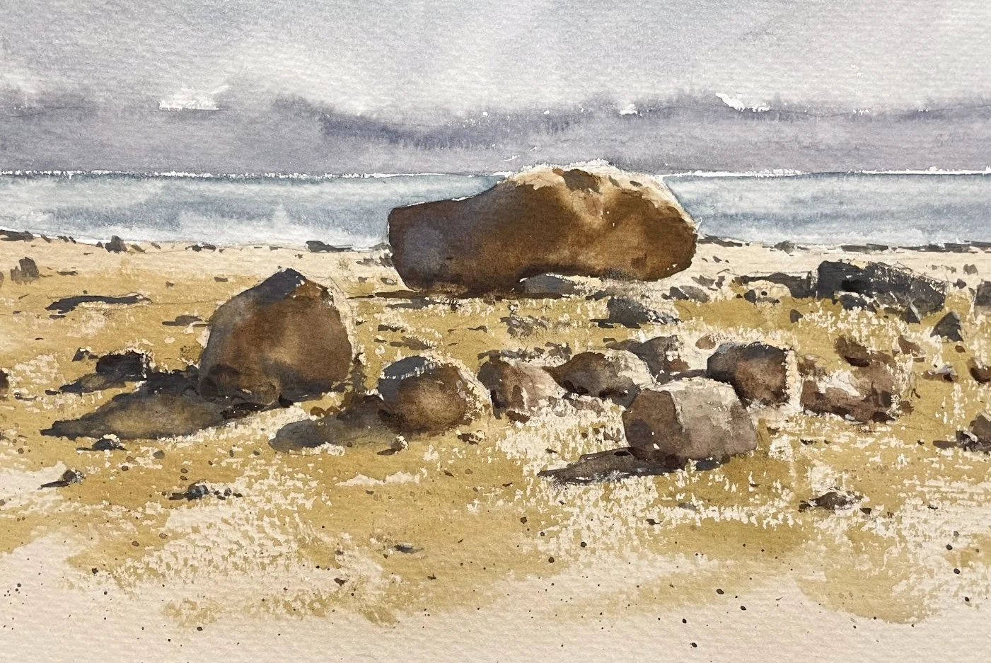
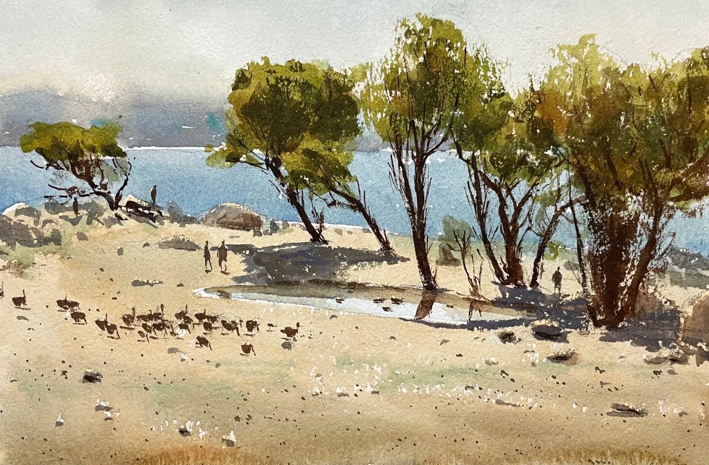
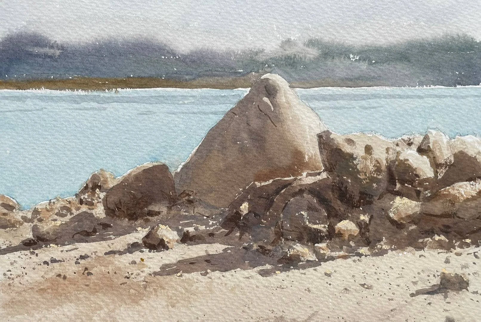
How to Create the Perfect Watercolor Painting Color Palette
Choosing colors to use for your palette can be a daunting task - especially for beginners - but it’s essential for growth and creating the paintings you wish to paint.
When I first began my painting journey back in 2011 (with acrylics), I mainly used a very limited palette consisting of white, yellow, red, & blue for the next 5-6 years. This helped me understand color-mixing quite well.
I became confident with mixing any color I was aiming for (within the limitations of my palette) quite quickly.
Using a Limited Color Palette
Eventually, I started slowly bringing in more colors one at a time to experiment with. I believe the next color I started trying was burnt umber - and eventually I replaced it with transparent red oxide, which I feel is a far superior color in terms of depth, saturation, and tone.
But either way - I started adding this brown into my paintings and more importantly, into the other colors on my palette.
At this point, this was my palette:
Titanium white (not necessary for watercolors)
Cadmium Yellow Lemon
Cadmium Red
Ultramarine Blue
Transparent Red Oxide
I used this palette for many forest scenes which I painted in acrylics and eventually in oils as well.
After I became comfortable with all of these mixtures and knowing what I’d get if I mixed the transparent red oxide into each color, I decided to play around with more colors.
Next, I believe I added Viridian - which is a strong, cool green. Around the same time, I also tried Alizarin Permanent. Now it was starting to get a bit complicated.
I began using these new colors in my paintings and understanding the mixtures they created. It also made me realize which colors I wasn’t really using. I realized I didn’t use Alizarin that much but I did find it necessary for some mixtures, so I kept it on my palette.
Exploring the World of Color
Eventually I tried a few more colors like Indian Yellow, Cobalt Blue, etc.. and made color charts which I wrote about here in 2017: Exploring Color with an Expanded Palette
The watercolor palette I now use is a bit similar to the one I mention in that post but some things have changed. And when it came to using watercolors, I did the exact same process I mentioned above about slowly adding color and becoming more familiar with them before adding more colors.
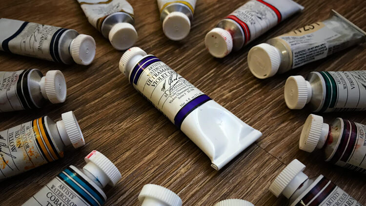
The most recent colors I’ve added to my watercolor palette are Ultramarine Violet Deep and Cobalt Teal.
Here’s my watercolor palette as of now (I’ve used these same colors for the past 2 years mostly, except for the recent additions I just mentioned):
Jaune Brilliant No. 1 (Holbein)
Cadmium Yellow
Indian Yellow
Cadmium Red
Alizarin Permanent
Viridian
Transparent Red Iron Oxide
Phthalo Blue (Previously added this one, but don’t use it anymore)
Ultramarine Blue
Ultramarine Violet Deep
Yellow Ochre
Cobalt Teal
Ivory Black
The “Why” Behind My Color Palette
All colors are from M. Graham watercolors but brand doesn’t really matter as long as you get quality paint and pigments.
So, why so many colors on my palette? Why do I need Ivory Black and Yellow Ochre? Can’t those colors just be mixed from the other colors on my palette already?
Well, yes I could just mix those colors. I could use Transparent Red Oxide with Ultramarine and get a black (which I actually do most of the time).
Or I could mix Cad. Yellow with Cad Red. and Ultramarine Blue and get Yellow Ochre. But let’s break down my palette into certain segments:
Necessary Colors
Cadmium Yellow
Cadmium Red
Ultramarine Blue
Convenience Colors
Yellow Ochre
Ivory Black
Indian Yellow
Other Helpful & Strong Pigments Which Can’t Be Mixed
Alizarin Permanent
Viridian
Ultramarine Violet Deep (kind of also a convenience color too actually)
Cobalt Teal
Transparent Red Oxide
So this is how I like to think about my palette. I have some necessary pigments - the primaries. Then, I have other pigments which are helpful, some of these are warmer or cooler version of the primaries - like Alizarin Permanent.
The Importance of Convenience Colors
And finally, I have convenience colors.
These are colors which aren’t really necessary at all, but they are time savers - especially when painting plein air, etc. They help me to mix a certain color very quickly.
For example, let’s say I was painting some golden, summer, dry California grass while painting outdoors. It’s very easy to just grab some Yellow Ochre and paint with that because it’s almost the exact color I’m looking for - sometimes I’ll mix a bit of red into it or blue, depending on the situation.
But now imagine if I didn’t have Yellow Ochre on my palette - what an inconvenience that would be when the light changes so quickly while painting plein air. That’s why my palette is the way that it is.
I’ve optimized it for painting plein air (outdoors), indoors in the studio from photographs, portraits, animals - just about anything. I can mix colors quickly and I have a few strong pigments like Cobalt Teal and Alizarin when I might possibly need them, like painting a brightly-colored car for example.
Find Your Own Colors
I encourage you to find the colors you enjoy using in your work and understand when and why you use them. Experiment with new colors and see if they are useful to your work and if they bring anything new to you and your work.
If they don’t, then get rid of them (or just use all of it until it’s gone) and try another color if needed. I’m still experimenting with new colors to this day and I find it’s a fun process.
Let me know what colors your palette currently consists of in the comments below. I’d love to hear from you :)
If you found this useful, be sure to share it.


I’m an artist exploring creativity, mindset, and the practice of making art over a lifetime. I share my work through writing, courses, and original paintings.